Well, this blogspot page didn't last that long. Researching the best options and recommendations for a UXD folio encouraged me to make a full on website of my own.
So, please head on over to
www.willjohnsnow.com
Where my blog continues, and there's much more to see.

Showing posts with label design. Show all posts
Showing posts with label design. Show all posts
Wednesday, 10 June 2015

Thursday, 4 June 2015
Website sneak peek
My soon-to-launch website is primarily to show my portfolio of user experience design work.
One project is my wireframing work I did for Pinewood Studios, another is my 'fate' course project from General Assembly, and the others are existing problems with a range of things I've been inspired to fix by applying UXD practices to.
One of those existing problems is HSBC's Business Internet Banking website, which I hope you don't have to use. Its main problem is it doesn't 'show the data', and the user has to work incredibly hard to work out what transactions they're not being shown, and then how to get them shown.
A final touch I've just made HSBC redesign page is an animated GIF showing how the user interacts with my new UI elements, and how the data is now shown to them:
 It took me an afternoon to make, which makes it even harder to understand how a company the size of HSBC can have such a woeful banking site.
This, and much much more will be launching soon on willjohnsnow.com (there's just a placeholder there at the moment).
One project is my wireframing work I did for Pinewood Studios, another is my 'fate' course project from General Assembly, and the others are existing problems with a range of things I've been inspired to fix by applying UXD practices to.
One of those existing problems is HSBC's Business Internet Banking website, which I hope you don't have to use. Its main problem is it doesn't 'show the data', and the user has to work incredibly hard to work out what transactions they're not being shown, and then how to get them shown.
A final touch I've just made HSBC redesign page is an animated GIF showing how the user interacts with my new UI elements, and how the data is now shown to them:

This, and much much more will be launching soon on willjohnsnow.com (there's just a placeholder there at the moment).
Tuesday, 28 April 2015
Two snippets: Merrell and Inside No.9
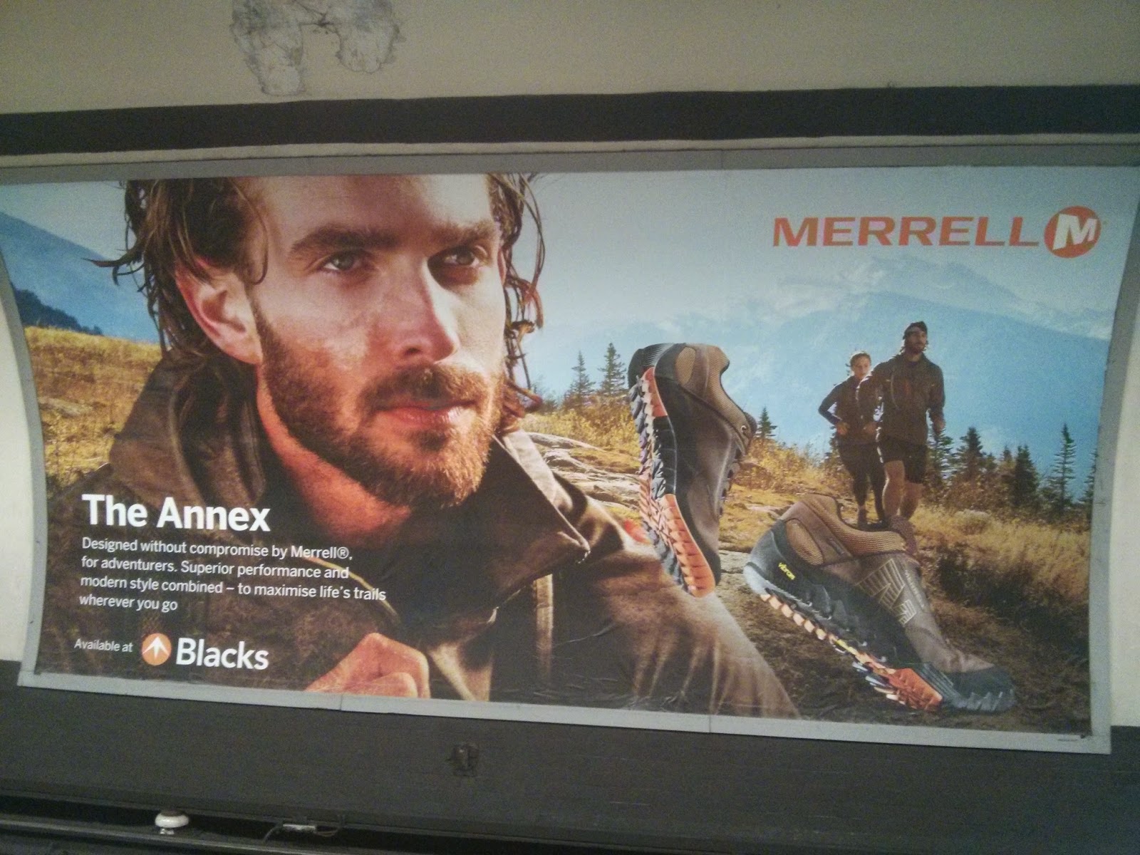
There's an advert I've been seeing around the Tube for Merrell walking shoes. I've had a quick search online but can't find it - next time I see it I'll take a photo and update this post.
UPDATE: HERE'S THE AD:
I've just started a part time UXD course (more on that later) and quite a few of my new classmates come from a design background - which makes me panic as I don't.
However, even I can't quite believe this advert got released. There's a big wide shot of a couple hiking in the background on the bottom layer, but they're massively overlapped by a hulking great portrait shot of a bloke's face that looks like it's taken from a Hugo Boss advert or something.
Worst of all, the actual shoes themselves - correct me if I'm wrong, but the supposed star of the advert? - are superimposed on top of the above, with one pressed down at the toe angle. (So ... the USP is the shoes can bend like 100% of the other walking shoes out there?) BUT, the madness doesn't stop there folks. Because these shoes are next to a whopping great head shot of this guy, they look LIKE TINY TOY SHOES - it's ridiculous! I couldn't stop looking at the advert with disbelief at its design.
I really hope this advert isn't considered decent design, because then there's not much hope for me.
As I see it, placement, scale, identity, theme and focus are just completely out of whack.
On a more positive note...
I'm just catching up with an excellent series on the iPlayer - Inside No. 9 by those League of Gentlemen blokes.
It's an anthology series, so each episode is unrelated to the next. I've only caught the odd episode so far, but having just seen Sheridan Smith's episode, I cannot rate it highly enough.
If you're looking for superb examples of sheer economy of storytelling, transitions, subtext, a twist, and an emotional thump at the end, then look no further. Totally top notch stuff.
You can watch the episode here.
You've only got until Saturday so hurry.
UPDATE: HERE'S THE AD:
I've just started a part time UXD course (more on that later) and quite a few of my new classmates come from a design background - which makes me panic as I don't.
However, even I can't quite believe this advert got released. There's a big wide shot of a couple hiking in the background on the bottom layer, but they're massively overlapped by a hulking great portrait shot of a bloke's face that looks like it's taken from a Hugo Boss advert or something.
Worst of all, the actual shoes themselves - correct me if I'm wrong, but the supposed star of the advert? - are superimposed on top of the above, with one pressed down at the toe angle. (So ... the USP is the shoes can bend like 100% of the other walking shoes out there?) BUT, the madness doesn't stop there folks. Because these shoes are next to a whopping great head shot of this guy, they look LIKE TINY TOY SHOES - it's ridiculous! I couldn't stop looking at the advert with disbelief at its design.
I really hope this advert isn't considered decent design, because then there's not much hope for me.
As I see it, placement, scale, identity, theme and focus are just completely out of whack.
On a more positive note...
I'm just catching up with an excellent series on the iPlayer - Inside No. 9 by those League of Gentlemen blokes.
It's an anthology series, so each episode is unrelated to the next. I've only caught the odd episode so far, but having just seen Sheridan Smith's episode, I cannot rate it highly enough.
If you're looking for superb examples of sheer economy of storytelling, transitions, subtext, a twist, and an emotional thump at the end, then look no further. Totally top notch stuff.
You can watch the episode here.
You've only got until Saturday so hurry.
Subscribe to:
Posts (Atom)